Ad specs & creative guidelines
Your creative is the offer a shopper sees after completing a purchase — a high-intent moment to earn their next click. It's built from your copy (a headline, description, and call to action), your brand logo, and, in some formats, product images. This article covers the specs your creative must meet and the best practices that help it perform.
Creative formats
Disco renders your offer in different formats depending on the placement and the publisher. You don't choose the format — the publisher's surface decides which one appears — so provide complete copy and a logo, and your offer will look right wherever it runs.
-
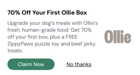
Text + logo — your copy alongside your brand logo.
-
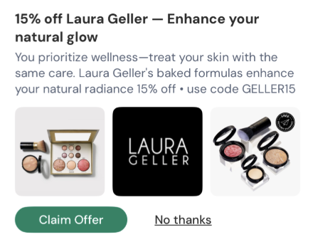
Gallery — your copy alongside up to four product images.
-
Featured product — your top product shown in a compact tile.
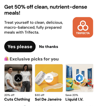
Product images in the Gallery and Featured product formats are pulled from your connected product catalog — you don't upload them separately. The assets you provide are your copy, your logo, and a banner image (requested from every advertiser — see below).
Copy requirements
Every creative needs three pieces of copy. Stay within these limits so nothing gets cut off:
| Field | Maximum length |
|---|---|
| Headline | 50 characters |
| Body | 175 characters |
| Call to action (CTA) | 25 characters |
The Gallery format uses shorter copy:
| Field | Maximum length |
|---|---|
| Headline | 20 characters |
| Subhead | 25 characters |
| Call to action (CTA) | 25 characters |
Tip: Because you don't control which format renders, write a headline that still works at the shortest limit (20 characters) so it's never truncated.
Logo & banner image
Your brand logo is set once on your account and carries across formats:
| Requirement | Spec |
|---|---|
| File type | JPG or PNG |
| Dimensions | 500 × 500 px (1:1 square) |
| Maximum file size | 5 MB |
Banner image — requested from every advertiser. Disco requests a banner image from all advertisers — whether or not you're on Shopify, and whether or not you have a connected product catalog. It's not required to launch, but it's good to have on file. Provide an evergreen image with no text baked in.
| Requirement | Spec |
|---|---|
| Aspect ratio | 16:9 |
| Dimensions | minimum 1064 × 600 px |
| Text | none baked into the image |
Landing page URL
Every offer needs a landing page — where a shopper goes after clicking your CTA.
- The landing page URL is required.
- It must start with
https://. - Include your UTM parameters so conversions track accurately — for example,
?utm_source=disco. Without them, conversions may not be attributed correctly.
Creative best practices
The post-purchase moment rewards offers that are clear, specific, and easy to act on. Apply these when writing your creative:
- Lead with the outcome, not the product. "Get up to $300 in extra cash" beats "Introducing our new financial platform."
- Make the value explicit. Concrete dollar amounts, time saved, or named benefits outperform vague offers.
- Create opportunity cost. "You could be missing out on $300" outperforms "See what's available."
- Put the value in the CTA. "See my $300" beats "Learn more" — if there's money or upside, it belongs in the button.
- Reduce perceived effort. Avoid friction words like "apply," "sign up," or "create an account." Try "check eligibility in under a minute" instead.
- Make the headline and body read together. They should make grammatical and contextual sense as a single thought.
Before you submit: a quick check
Run your creative against this checklist:
- Value clarity — Can a shopper tell what they get in under three seconds?
- Specificity — Is there a concrete upside (a dollar amount, time saved, a named benefit)?
- Opportunity cost — Does the copy suggest they might miss out?
- Effort — Does it sound easy and low-risk? Are friction words softened?
- CTA strength — Does the CTA restate the value? Would it make sense on its own?